Rain / Snow
General article about Rain Theme and it's functionalities. You will learn about all features included in this theme.
Rain settings
Custom configuration in theme properties
- Login to your "Admin Contol Panel"
- Go to Appearance tab and click Styles. You will see list of your themes. Pick Rain or Snow.
- Click Styles properties on far right in same row as theme name.
- Click Rain Settings (or Snow Settings if using Snow theme).
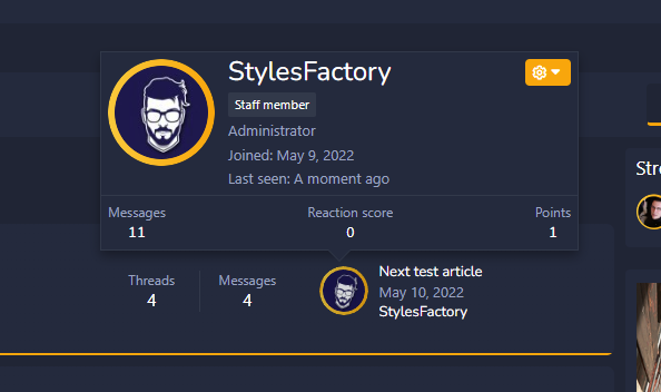
- I will explain each option that is listed. Let's start with Avatar border color tab. You can set color for your border around avatar.
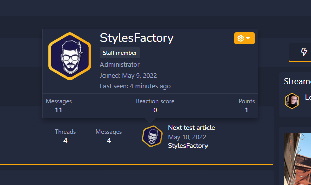
By default it's set to #FFC837. Avatar border color gradient is set to #FFA500 by default.
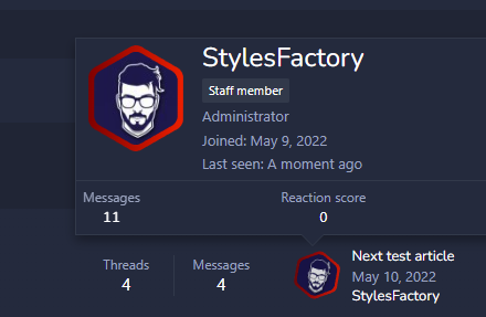
Example after changing colors:
Avatar shape is custom setting where you can set other shape around your avatar.
Example: clip-path: circle(50%);
How to change logo?
- Login to your "Admin Contol Panel"
- Go to Appearance tab and click Styles. You will see list of your themes. Pick Rain or Snow.
- Click Styles properties on far right in same row as theme name.
- Click Settings.
- Find Logo URL and change it for your link. By default it's styles/rain/rain-logo.png. You can also use uploader icon.
Theme was designed to make logo fit inside navigation bar. Default size of Rain/Snow logo is 100px x 36px.
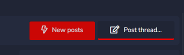
How to change underline color?
- Login to your "Admin Contol Panel"
- Go to Appearance tab and click Styles. You will see list of your themes. Pick Rain or Snow.
- Click Styles properties on far right in same row as theme name.
- Click Color palette.
- Find Primary tab and Color 1 setting. It's set to orange by default.
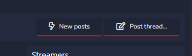
After changing color:
How to change button colors?
- Login to your "Admin Contol Panel"
- Go to Appearance tab and click Styles. You will see list of your themes. Pick Rain or Snow.
- Click Styles properties on far right in same row as theme name.
- Click Color palette.
- Find Primary tab and Color 5 setting. It's set to #FFB327 by default.
After changing color: